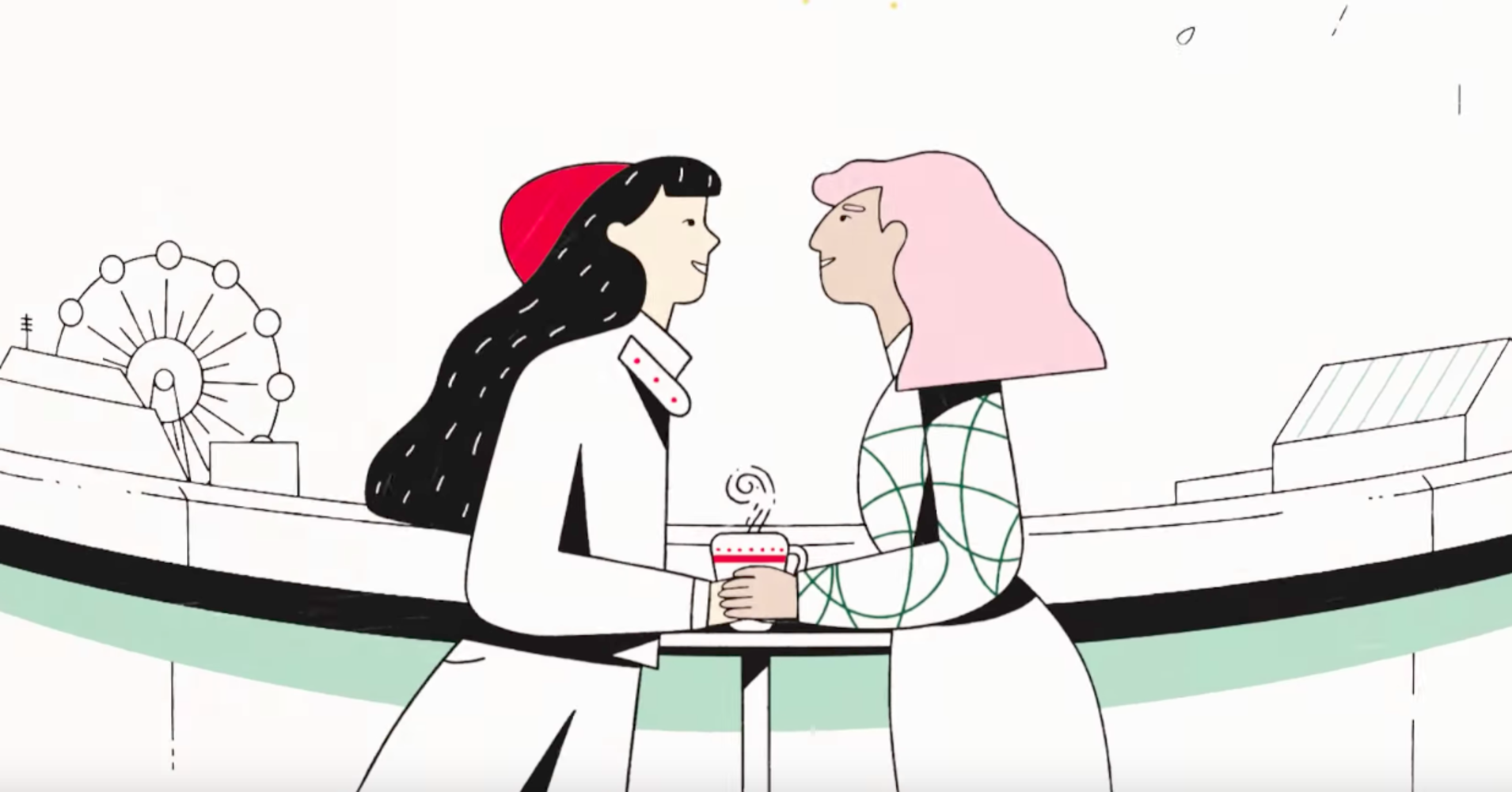
2017 Holiday campaign for Starbucks, created by Buck.TV
When I first started out as a designer at a design agency a few years ago, everyone seemed to be designing in a minimal style. It was all about vast white spaces, rigid character proportions, shades of grey and blue…line iconography. As someone with an traditional illustration background, I found this so fresh. Minimalist design has a calming, orderly sentiment to it. This new perspective fed into my illustrative style as well. Why bother with face expressions…or color..or texture? However, over the years design sensibilities has shifted into something quite different.
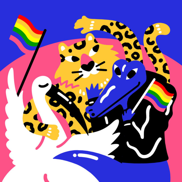
Facebooks new illustration style, “Alegria” Created by Buck.tv
Design and illustration these days is so bold and expressive, jumping off the page in a racket of color. We’re embracing the hand crafted qualities of screen printing and collage. We’re going to town with textures and patterns. What was it about 2014 that had us zenning out over white space, and 2018 is full of colorful chaos?

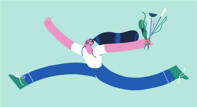
Spotify Campaign, created by Cecile Gariepy
It could be a reflection of the times we’re living in. After all, the ground beneath us is shaking. We are living in a violent sphere of sensory overload- of hashtag movements taking to the streets, of a president spouting lies and hatred, of fake news, corruption, and divisive ideologies. So why are we running to the Color Factory, and the Museum of Ice cream to take a selfie for instagram in front of endless sprinkles and vibrant walls? And why are we more obsessed with unicorns than ever before?? Why is design reaching full boost mode on the delight and playfulness factor in troubling times?
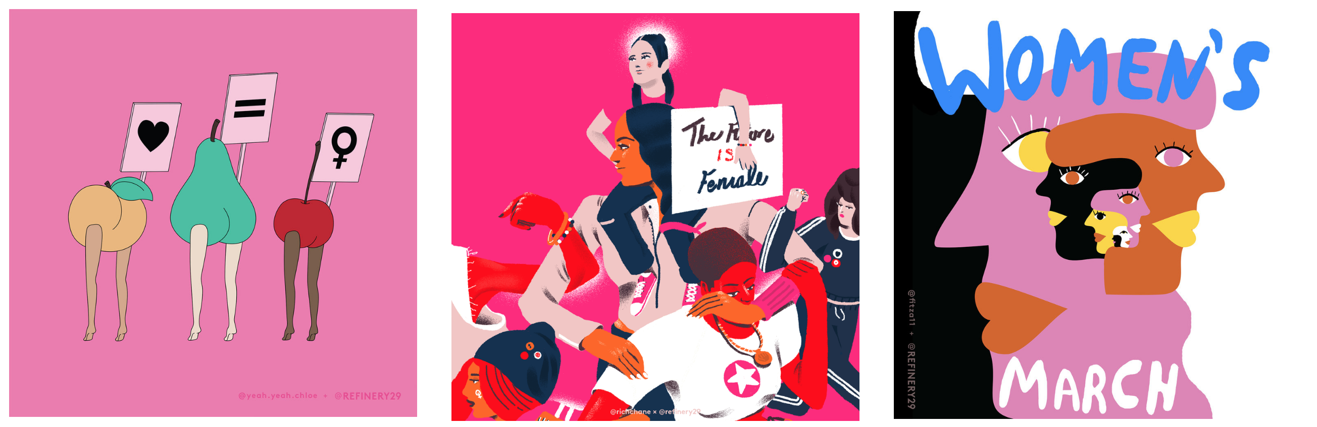
Left to right: Chloe Bennet, Richard Chance, and Franziska Barczyk for R29 X WOMENS MARCH
Perhaps it might have to do with the fact that design and illustration evokes an emotional response. We have gone the way of collective escapism through maximalist design, seeking refuge in the things that make us happy. On the surface this might look like a pretty shallow way of dealing with things, an unnecessary distraction. Better to look at a wall of white space and contemplate- as if you’re in time out. This couldn’t be further from the truth! Through design and illustration we are channeling empowerment. We are celebrating diversity, and the things that bring us together. We are using humour and expression to communicate uncomfortable truths. We are using visual communication to heal and unify. While we can’t change the things around us that out of our grasp, we can take our pens and visualize the world we want- and ultimately create it.